SC-EDIClient cabinetB2B e-documents2022, shipped
A B2B platform for legal e-documents. I designed the cabinet that shipped, then rethought it in 2025.
View case →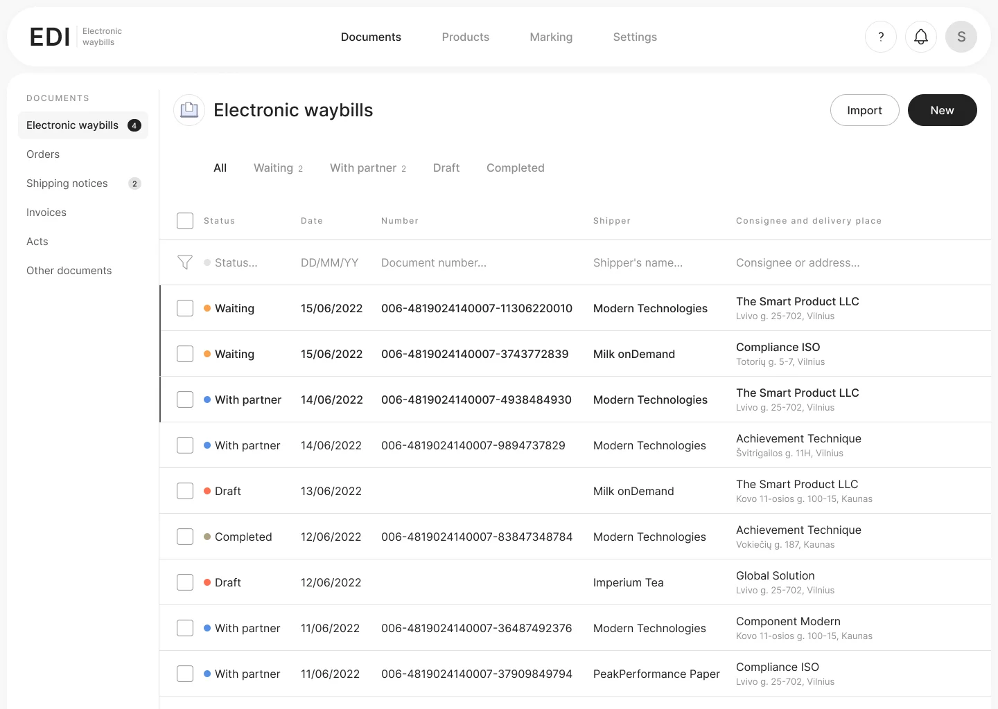
Siarhei Bekish, senior product designer in Warsaw. Seven years of B2B and fintech web products: document flows, banking accounts and CRMs.
I take legacy systems that grew without design and turn them into clear flows people use all day. I test ideas with real users, build design systems and work closely with developers. Most recently, four years at Flo Health adapting product UI for 20+ languages.
A B2B platform for legal e-documents. I designed the cabinet that shipped, then rethought it in 2025.
View case →
A legacy system for housing office staff turned into clear flows for accounts, bulk edits and reports.
View case →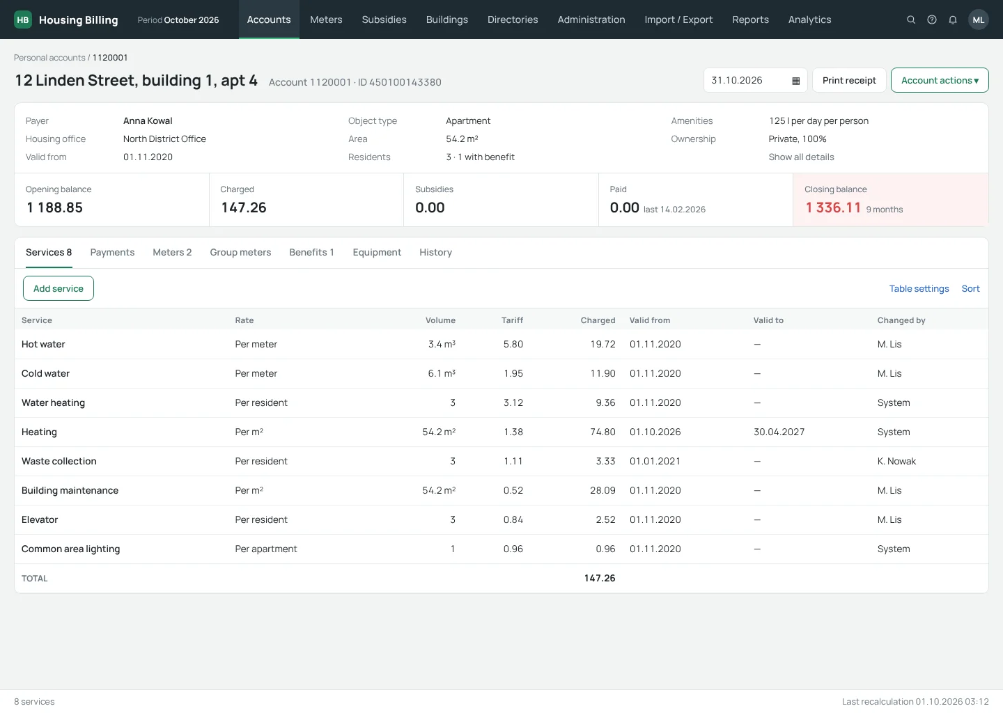
I designed this site and built it in code with Claude: layout, interactions and case pages, from first idea to deploy.
Back to top ↑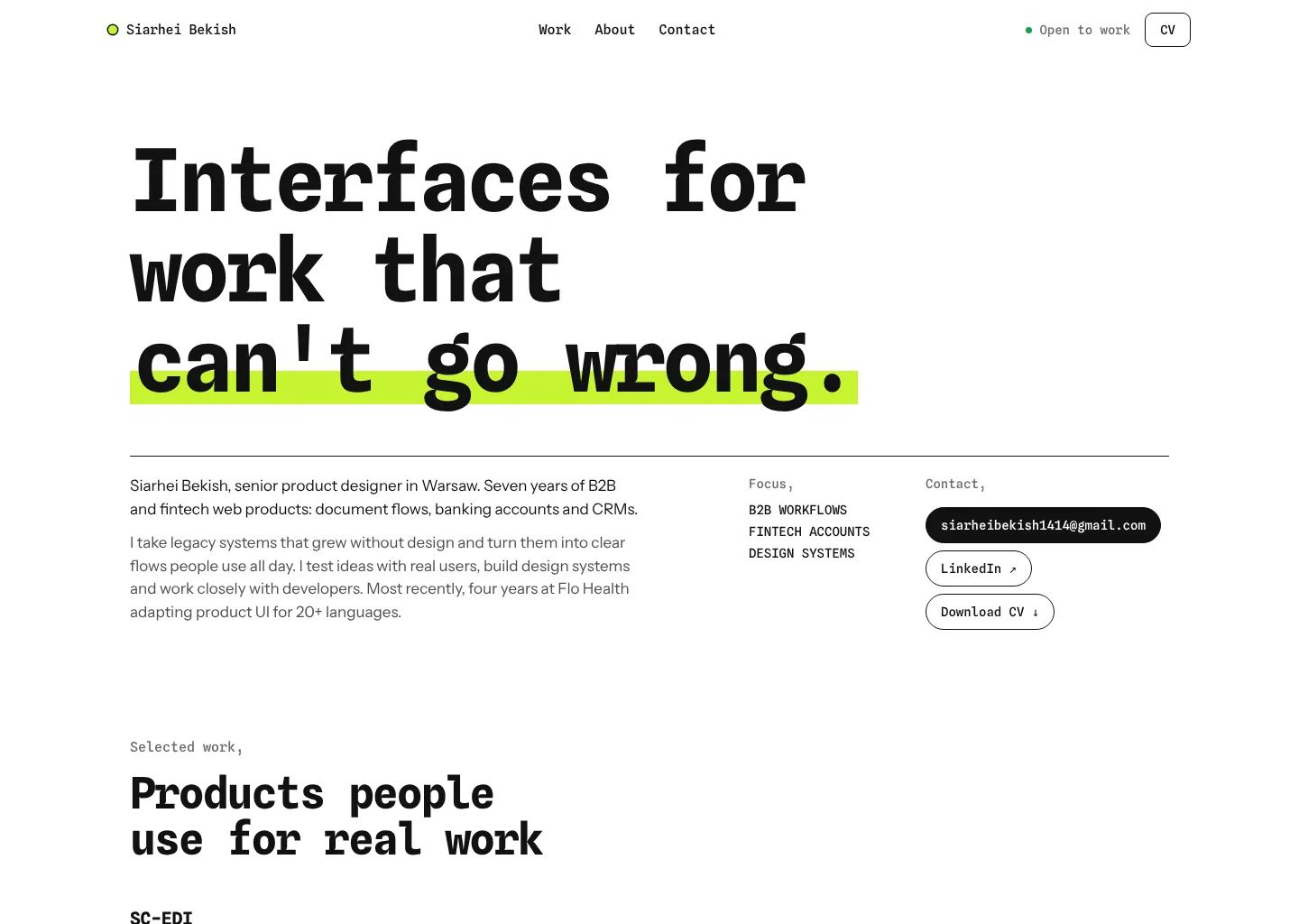
Account areas for individuals and businesses at a large bank. Screens are under NDA, so I show this project on a call.
Ask for a walkthrough →
I'm a product designer with 7+ years of experience in B2B, fintech and SaaS. I've designed CRM and back-office systems, banking account areas for individuals and businesses, and an e-invoicing platform that went to production. At Flo Health, I adapted product UI for a global audience in 20+ languages. I enjoy turning messy workflows into clear, scalable interfaces.
Open to remote and B2B contract roles in product design.
I designed the client cabinet for creating, signing and tracking legally binding electronic documents, and it shipped to production. In 2025 I came back to my own work and rethought it. This case shows both.
SC-EDI is a B2B platform for exchanging legally binding electronic documents between companies: waybills, orders, shipment notices and acts. Documents are signed with a digital signature and checked against national requirements for product marking and traceability.
Accountants, logistics and sales staff at client companies, who create, sign, send and track documents every day.
The cabinet was built by developers without a designer and had no consistent visual logic.
Many fields, unclear order and no guidance made creating a document slow and error prone.
It was hard to see which documents needed action and where each one stood.
Goal: make everyday document work fast and clear, without changing the legal logic behind it.
The hardest part for the client was creating a document. It was one very long page with many forms and no clear hierarchy. Required and optional fields were mixed together, so people never knew what they had to fill in and what they could skip.
This became the main problem I set out to solve.
I mapped how the existing cabinet worked and where users got stuck, then built an interactive prototype. Instead of waiting for release, we tested it with one of the platform's key clients.
The full path of creating a document, from the first dialog to the last field. The question was simple: is the new form clearer than the old one, and can the client fill it in without help?
The new structure worked: the client understood the sections and the required fields. Their comments were about where some forms sat on the page, so I reordered and regrouped those blocks before handing the design to development.
Two of my original screens of the shipped cabinet, in Russian, as clients used them. Click to see them larger. Company names are demo values.
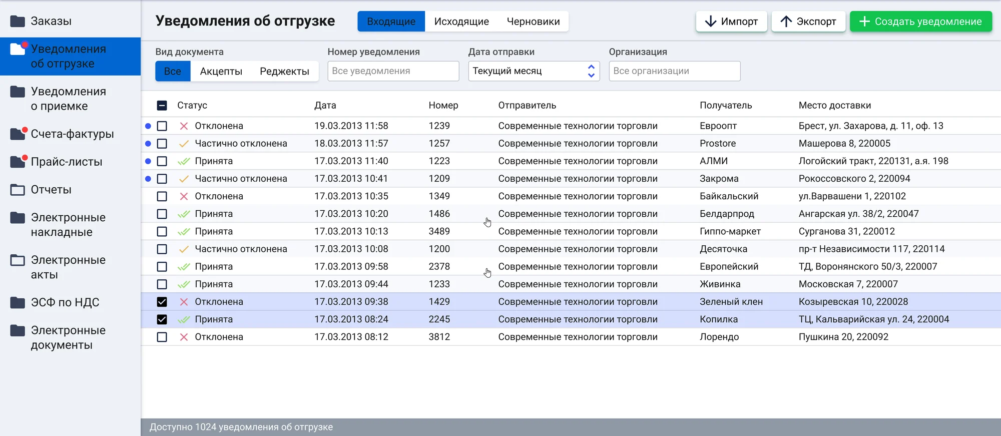
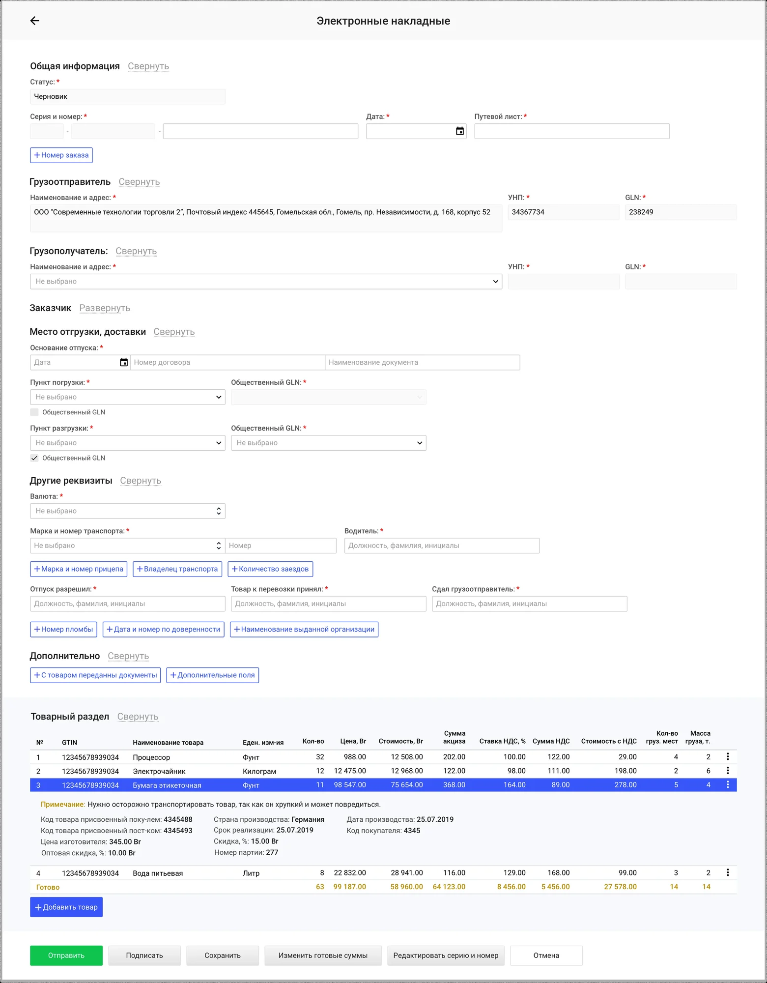
Three years later I came back to the cabinet with more experience. I kept the structure and flows that worked, and changed what I would design differently today. This version is a portfolio project, not a shipped release.
The shipped form solved the client's main problem, but it still showed everything at once. Here is the same waybill: what shipped, and how I would design it today.
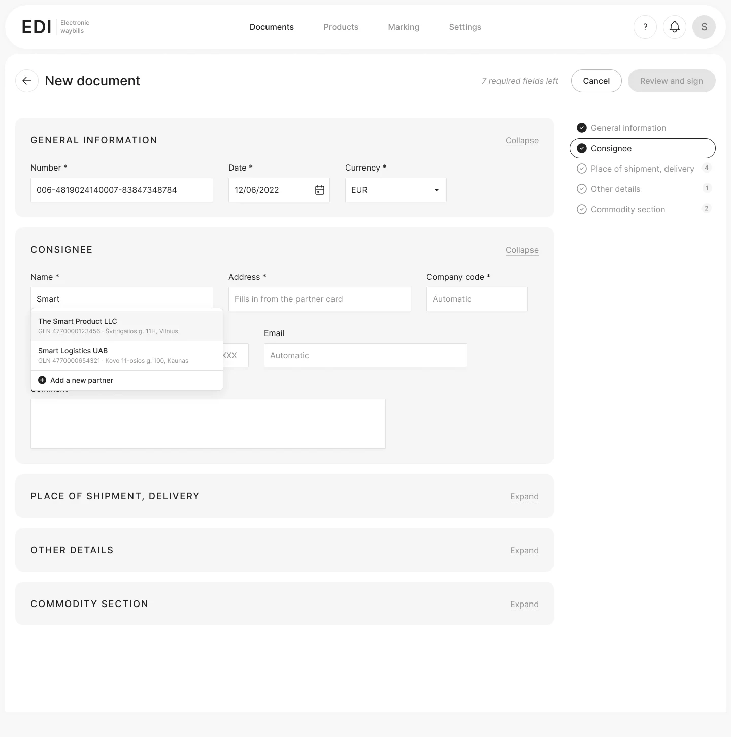
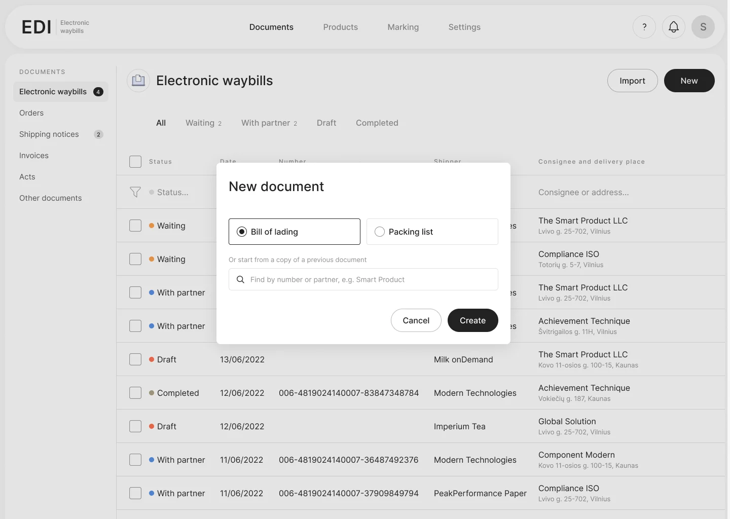
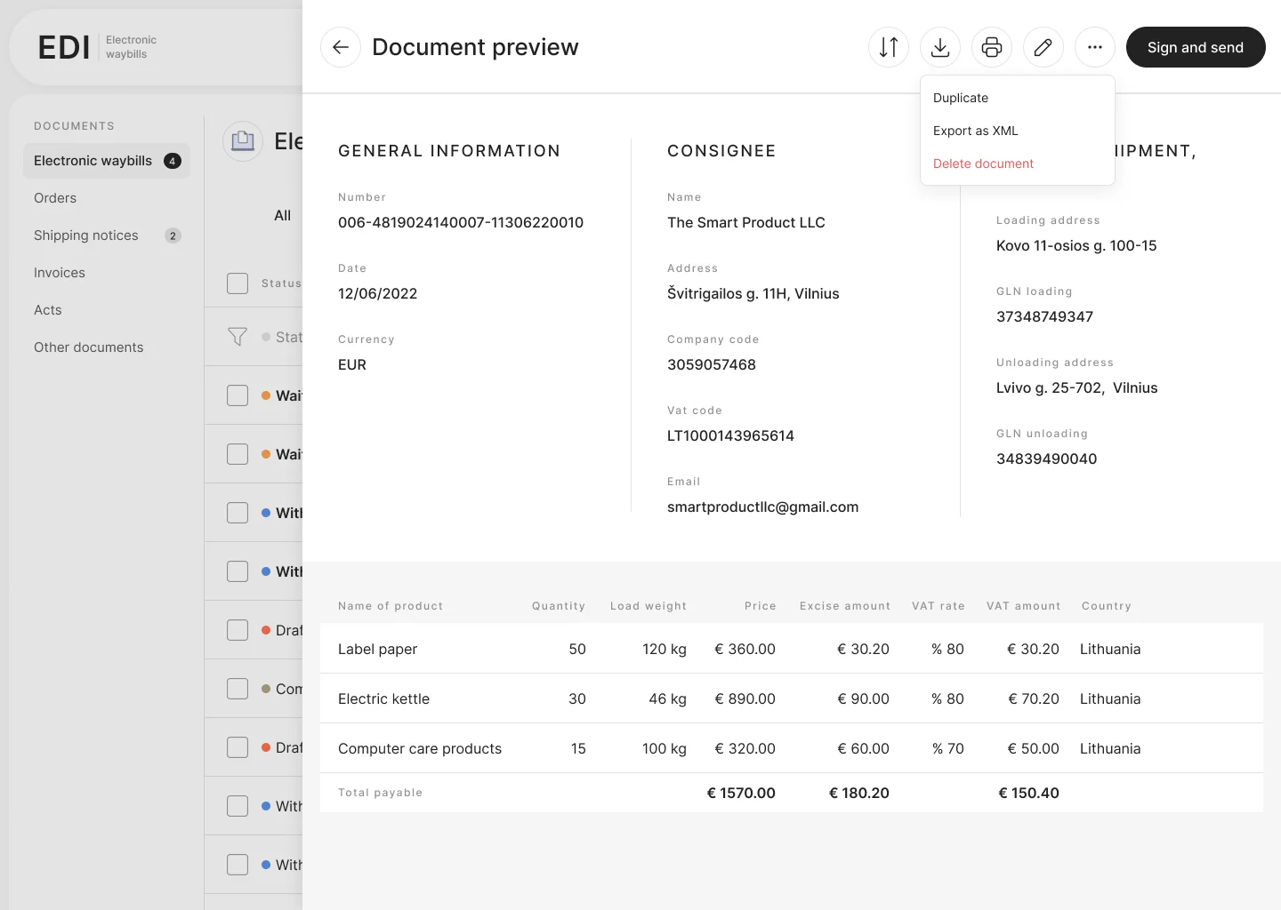
In my first version, the document type hid behind a small switcher next to the title. I tried a segmented control and type cards, then chose a side navigation: type, then status, then document, a clear hierarchy. To keep the table readable, consignee and delivery place now share one column, with the name on top and the address below.
Status tabs (Waiting, With partner, Draft, Completed) get counters, and every row gets a colour status marker. I renamed "In supplier" to "With partner", because users did not read it as "waiting for the other side".
Every column of the table has its own filter, and filters can be combined: for example, a partner and a period. Accountants work with hundreds of documents, so search had to be part of the table, not a separate page.
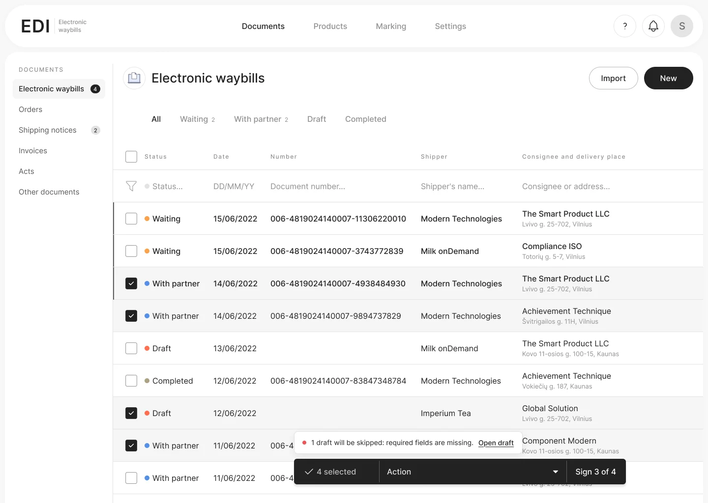
A floating action bar appears after selection. If one of the selected documents is an unfinished draft, the button says "Sign 3 of 4" and a hint explains which one is skipped and why, with a link to open it.
Many shipments repeat: the same partner, the same goods. The create dialog lets users pick a document type or find a previous document by number or partner and start from its copy.
Users typed the consignee's name, address, VAT and company code by hand. Now the name field searches the partner directory by name or GLN, and the rest of the card fills in automatically.
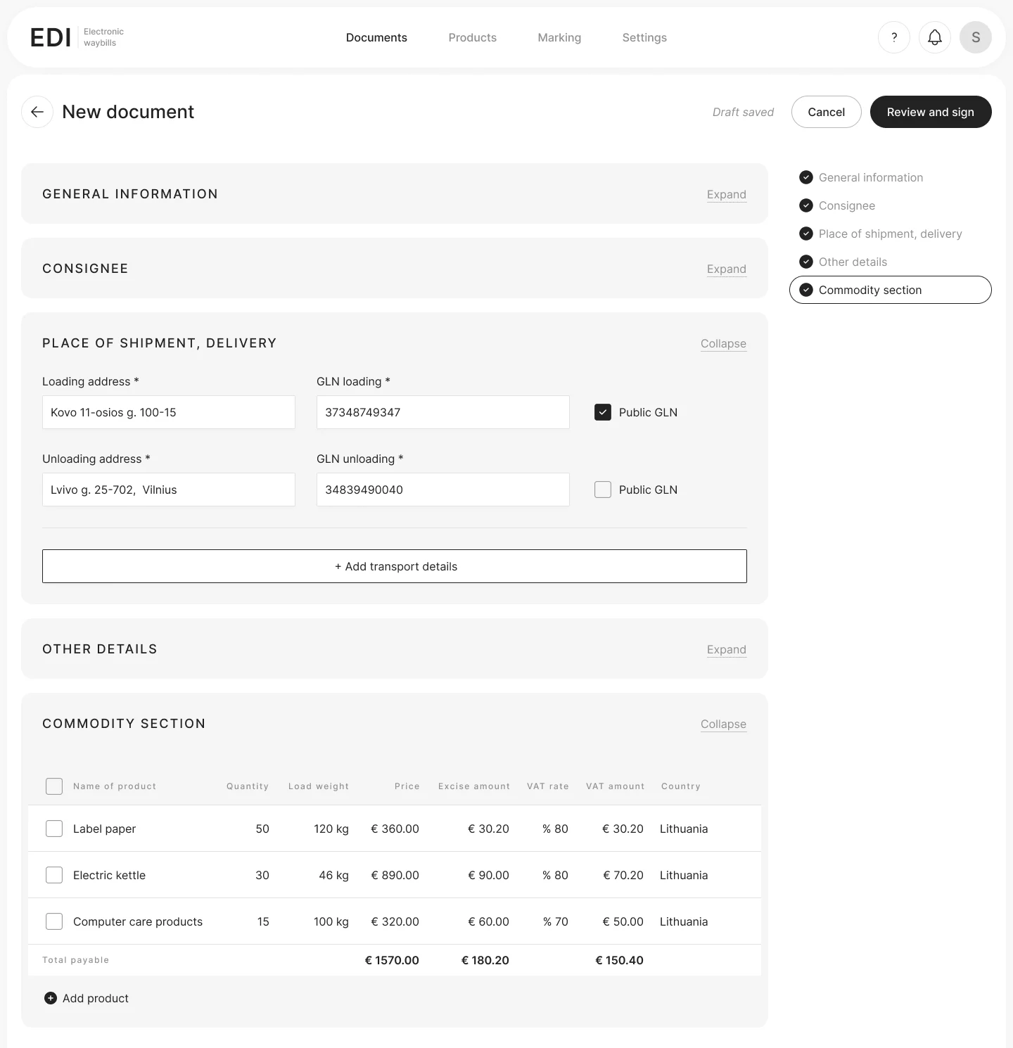
Each section is a card that follows how a waybill is filled in. The navigation on the right shows done sections and how many required fields are left in the others, and the header repeats the total next to the main button.
The form button became "Review and sign", so users know what happens next. The preview has one main action, "Sign and send". Delete moved into the "⋯" menu, away from everyday actions.
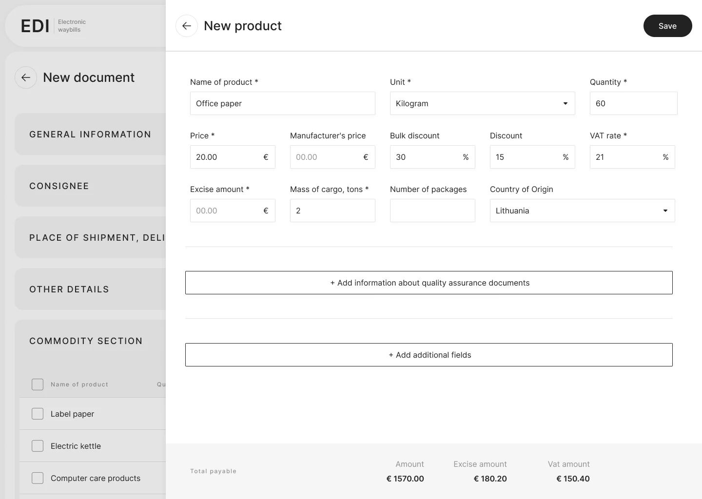
The same flows, redesigned and in English. Click any screen to see it larger.
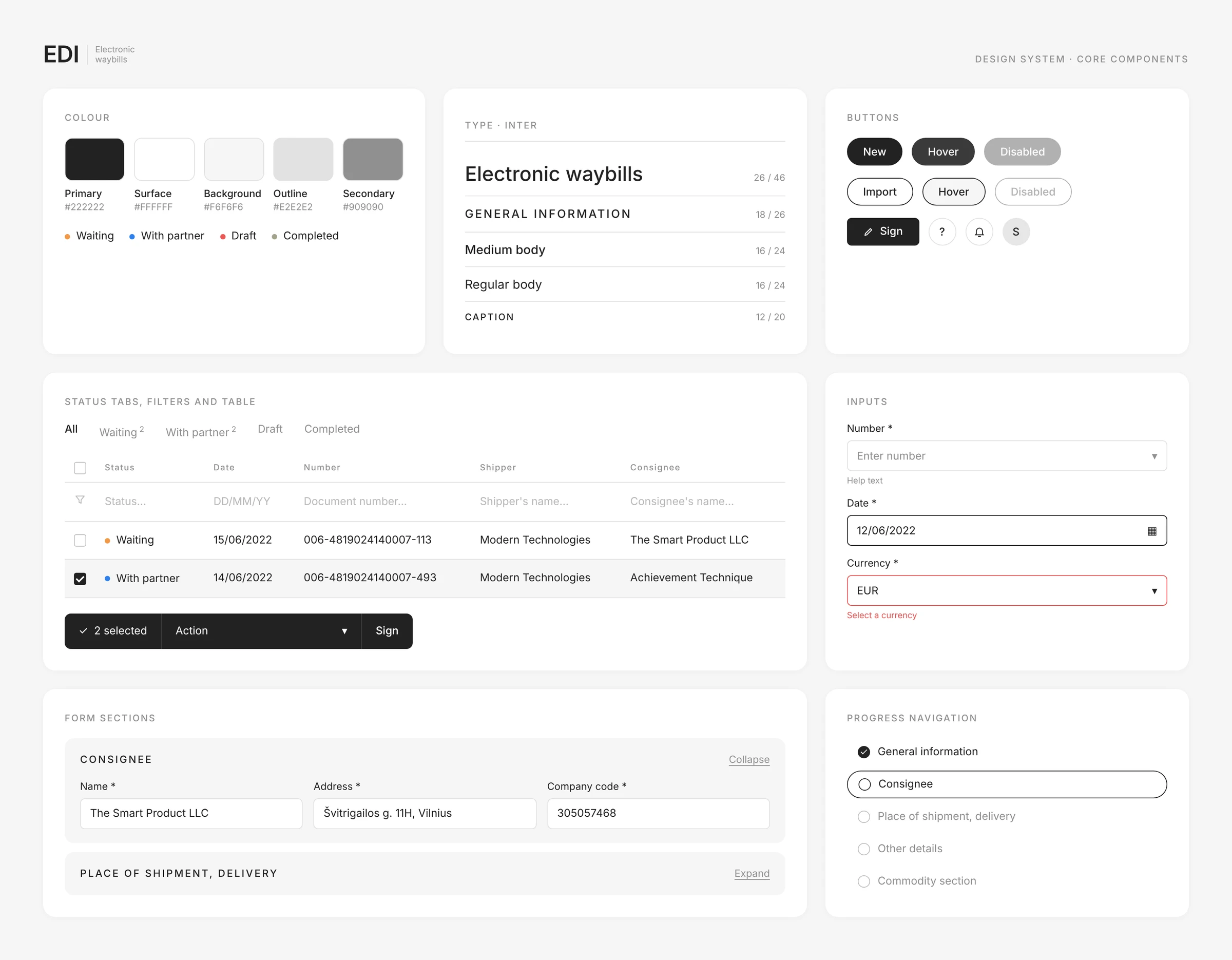
The new version is built from a small component library in Figma: buttons and inputs with all states, table rows, form sections and the progress navigation. Every document type uses the same parts.
My cabinet replaced a developer-built interface and was released to production. The key client's feedback on the prototype was built into the design before development.
In B2B products with legal requirements, the hardest part is not the visuals but the structure: how to make a complex, regulated process feel simple. Testing a prototype with a real client early saved the team from building the wrong thing. Coming back to my own work three years later showed me how much calmer a dense B2B screen can be.
"What shipped" shows my original production screens from Figma. Part 2 is my 2025 redesign of the same product, made for this portfolio. Website and code: designed by me in Figma, built with help from Claude.
Housing office staff use this system every day to manage residents' personal accounts, charges, payments and reports. I redesigned a legacy interface that developers had built without a designer.
An internal system for accounting, calculating and billing housing and utility services. Housing offices use it to manage residents' personal accounts, record payments, edit building data and prepare reports.
Staff of housing maintenance offices, who work in the system the whole day and handle hundreds of personal accounts.
Developers built the interface without a designer. Screens had no shared logic for layout, controls or states.
Dozens of fields, columns and buttons competed for attention on every screen.
Finding an account, changing its data or preparing a report took too many steps.
Goal: make daily account work clear and fast for housing office staff, while keeping the existing business logic.
I audited the legacy system and mapped the core tasks of housing office staff. Usability testing with employees showed the key pain points, and the new version addressed them. Then I designed the main flows, dialogs and reports and prepared specs for development.
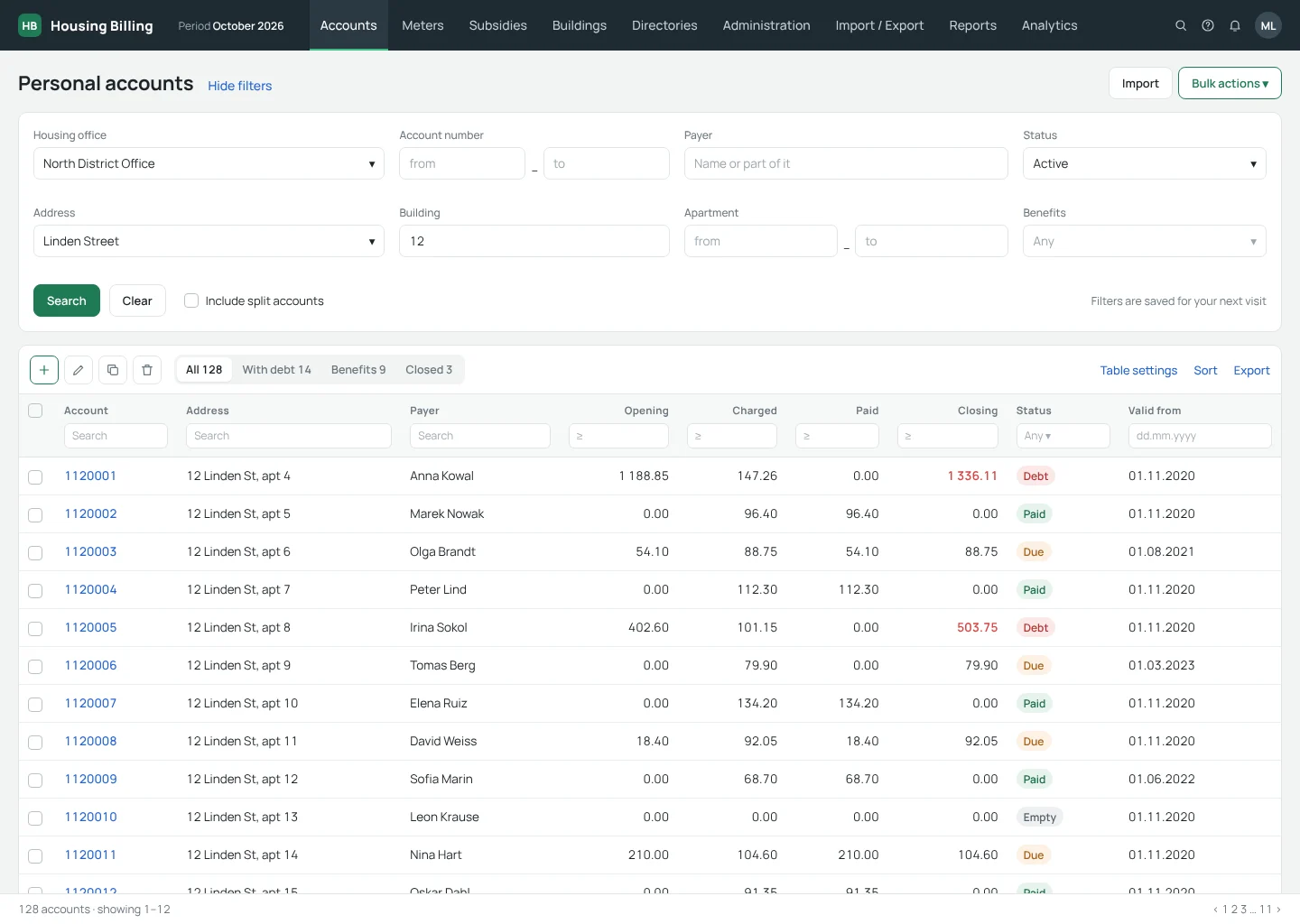
The account list opens with four key filters: organization, address, account number and status. One link hides them, so the table gets the full screen once the search is set, and the filters are saved for the next visit.
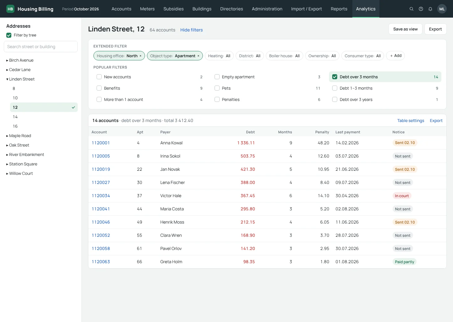
Analytics starts from an address tree, so staff pick a building instead of typing filters. The most common questions, such as debt periods, benefits or empty apartments, became one-click filters with live counts.
The account card opens with the address and the five numbers staff check first: opening balance, charges, subsidies, payments and closing balance. Secondary details sit behind one link, and services, payments and meters live in tabs.
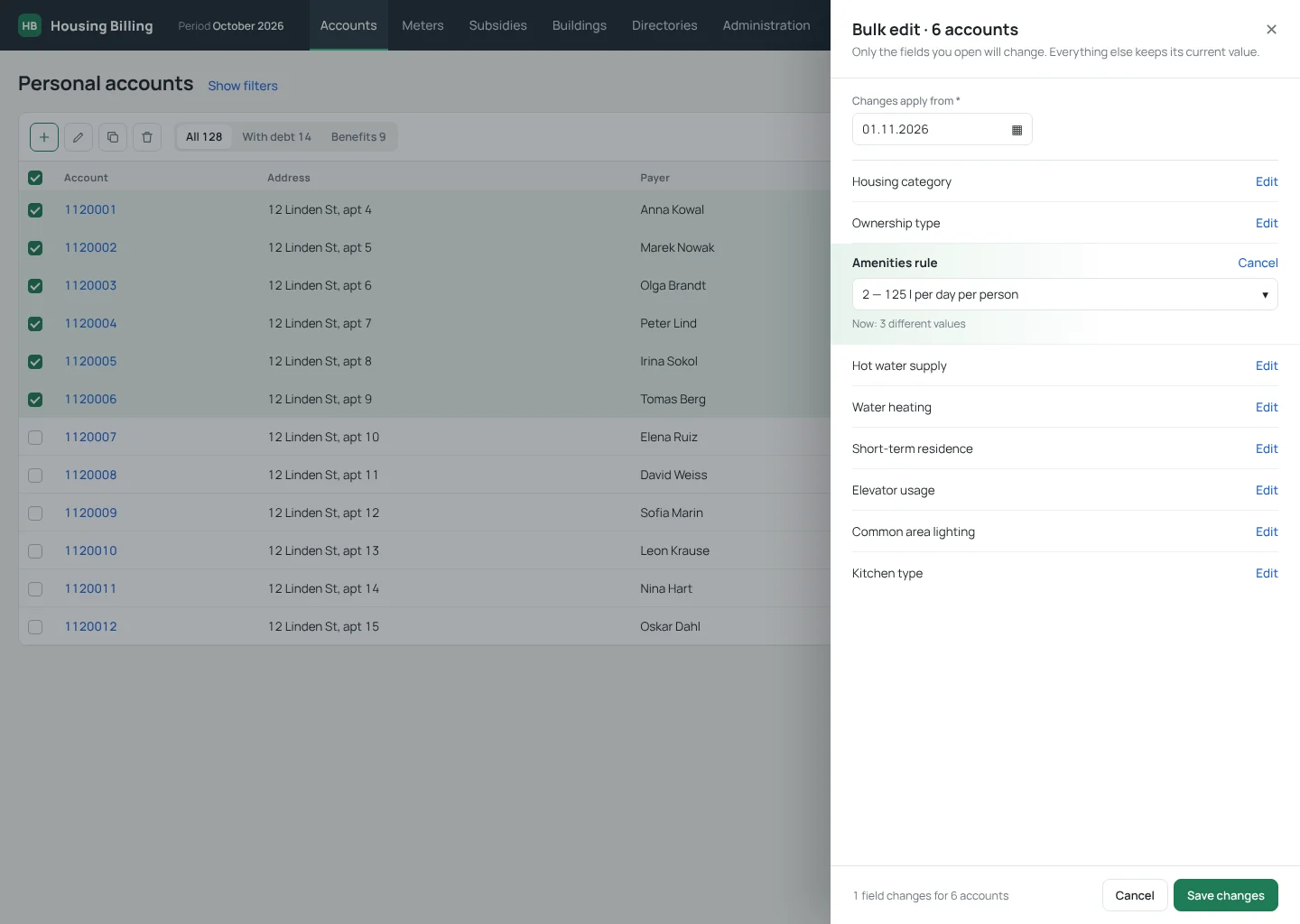
Staff often change one rule for a whole building. They select the accounts and open one side panel where every field has its own Edit link, so only the fields they touch change, from a clear start date.
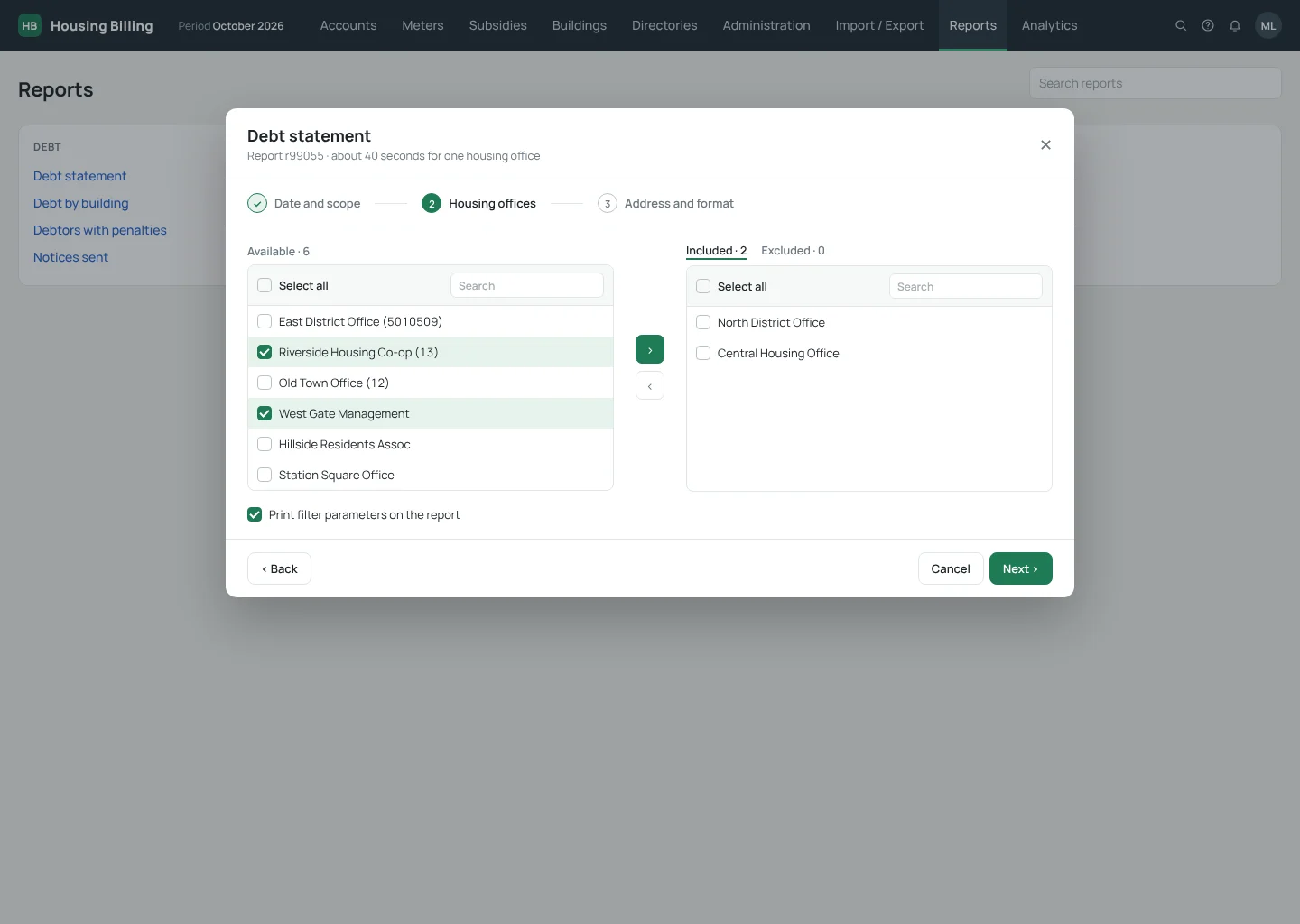
Report forms showed every parameter at once. I split them into scope, filters and format, and used a two-list picker to include or exclude service organizations.
Accounts, the account card, analytics, bulk editing and reports. Click any screen to see it larger.
The redesigned flows, dialogs and reports were handed off to the development team with specs. I left the company before the release, so I can't share production metrics.
In internal systems, people spend the whole working day in the interface. Small changes, like hiding filters or editing in bulk, save more time than visual polish. Testing with real employees showed what to fix first.
The original screens are under NDA. For this portfolio I rebuilt the key screens from my original layouts with a refreshed visual style, in English. All names, addresses and numbers are fictional. Structure, flows and decisions are the ones from the project.